The best design solutions don't just solve problems—they create shared languages that bring teams together. When we transform complex processes into clear, memorable visuals, we don't just improve efficiency; we build bridges between people and create ownership across the organization.
When Nordstrom launched their Return to Rack (RTR) initiative to streamline, consolidate, and reduce expenses on return processes, they encountered a classic organizational challenge: multiple teams operating with different versions of the same process. This fragmentation led to bottlenecks, inconsistent execution, and frustrated employees who couldn't efficiently serve customers needing to make returns. The project had stalled as teams struggled to align their workflows, with no version of the process accurately representing the actual needs of employees or customers.
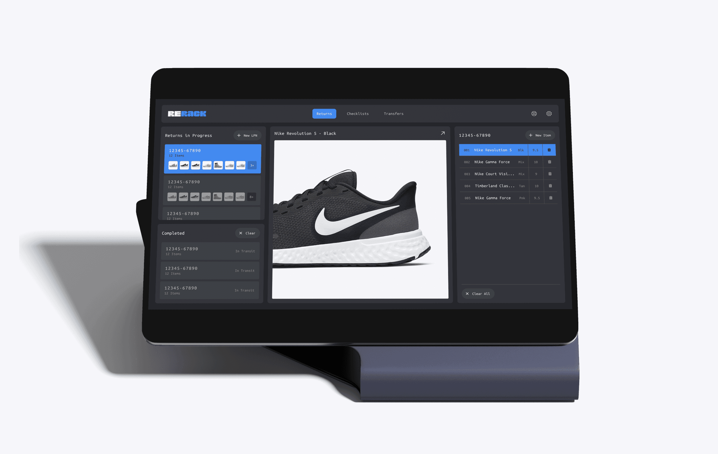
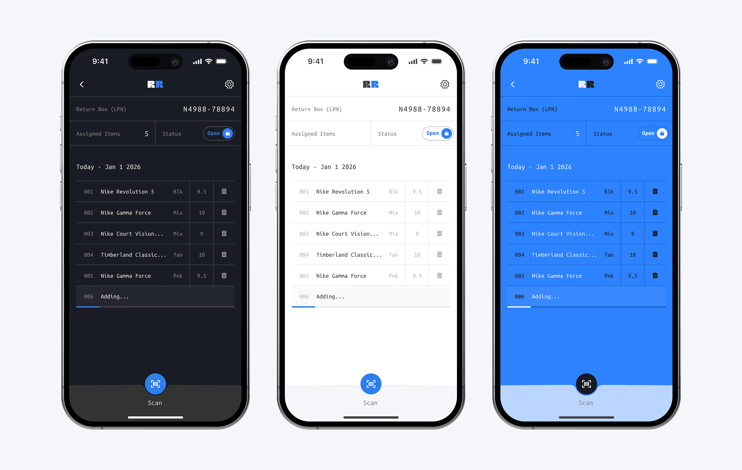
Through extensive research across multiple Nordstrom locations, I uncovered the key pain points: 16.5-minute average processing times, complex interfaces juggling four different views, and a manual system that created anxiety for both employees and customers. The challenge went beyond technical fixes—it required fundamentally rethinking how information was communicated across the organization and how employees were trained on new processes.
Rather than creating another traditional process flow document, I developed an intuitive infographic that simplified the entire return journey into memorable, visual steps with clever naming conventions for each microprocess. This approach addressed both the immediate technical challenges and the deeper organizational need for a single source of truth. The visual language made the process immediately understandable, transforming what had been a source of confusion into a tool for alignment and training.
The results were transformative: processing time dropped from 16.5 to 8 minutes, average return processing time decreased by 65%, and customer satisfaction scores rose to 72-97%. Most significantly, the infographic became the universal reference point for all teams, centralizing process changes and achieving a 100% process completion rate among trained employees. What began as a technical challenge evolved into a demonstration of how thoughtful design can bridge organizational divides and create shared understanding across diverse stakeholders.