Nordstrom Rack + Hautelook
Designing confident purchasing through peer validation
Ecommerce
UX/UI
Research
Return rates aren't just an operational problem—they're a symptom of customer uncertainty. This case study demonstrates how thoughtful design of a review system transformed shopper confidence and significantly reduced Nordstrom Rack's unsustainable 60% return rate by addressing the fundamental digital confidence gap.
Nordstrom Rack and Hautelook operated as separate off-price business units of Nordstrom, both facing a challenge that plagued the retail industry: unsustainable return rates. While some companies like Trunk Club had built returns into their business model, our returns had become excessive. Our leaders challenged us to find a better solution. Our goal post was to reduce returns by at least 4% within the next 12 months, while increasing purchasing and maintaining engagement.
Scope
Ambitious goals with brilliant partners
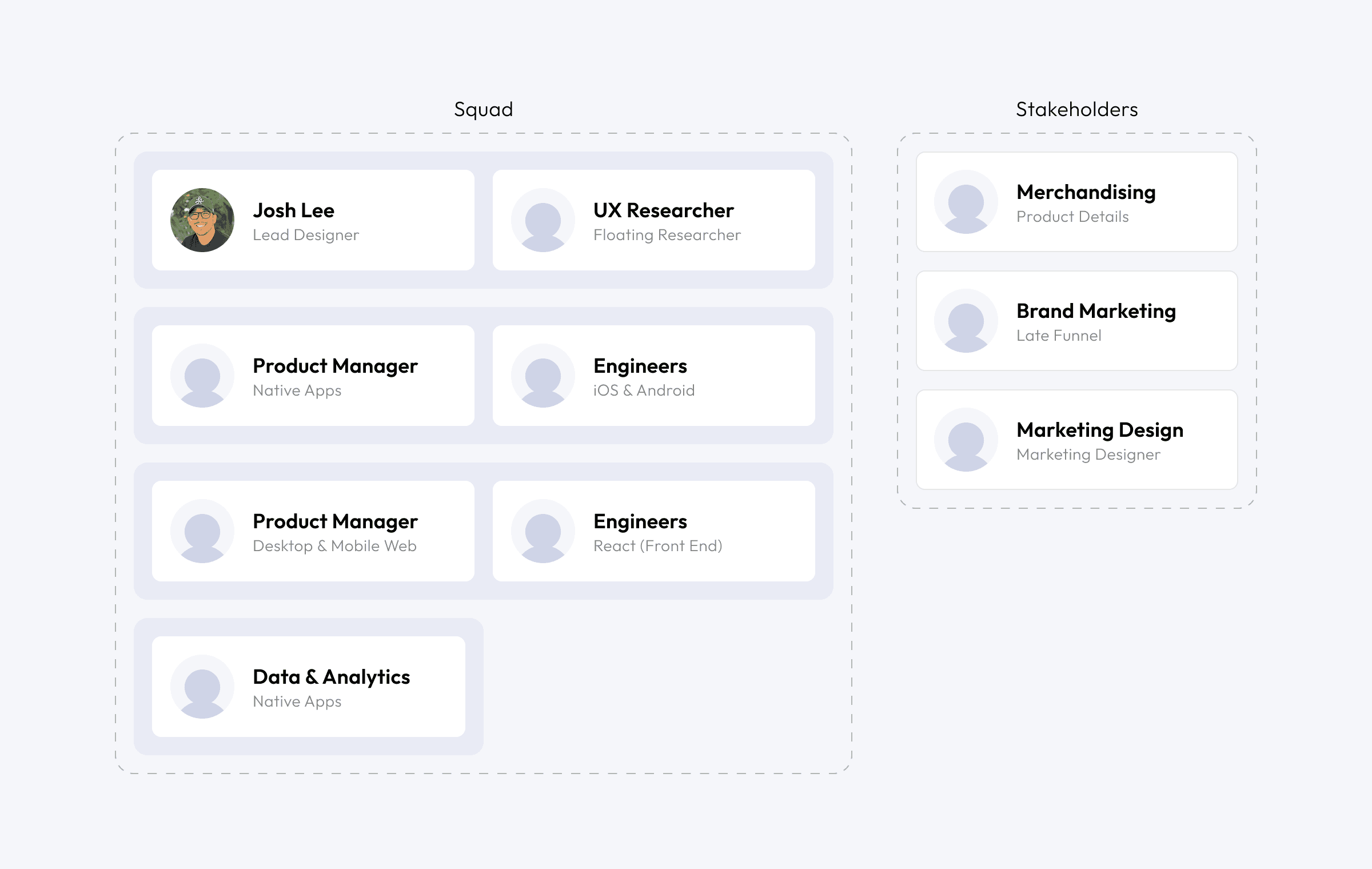
I led design and research, partnering with multiple product managers, multiple engineering teams, a program manager, and a data analyst to fundamentally reimagine how customers could shop confidently in a digital space.
Challenges
Return rates climbed above 60%, with some returning up to 70 items at once
Customers were turning their homes into fitting rooms due to fit uncertainty
Technical limitations in our inherited review platform restricted customization
Resource constraints included limited research budget and tight timeline
Organizational resistance to showing negative reviews due to conversion concerns
Discovery
Uncertainty drives returns
Through surveys of ~400 customers, card sorting, and comparative analysis, we identified a fundamental problem: The Digital Confidence Gap—customers cannot touch, feel, or wear clothes until they arrive, creating uncertainty that drives returns. Our research revealed key reasons why customers returned items:
Why Return?
Bad Fit
42%
Mismatched
28%
Found Better
17%
Single Use
7%
Just Because
3%
Seasonal
2%
Why Keep?
Liked Comfort
37%
Good Value
29%
Liked Style
12%
Enhances Outfit
11%
Flattery
6%
No Surprises
4%
Who?
Review Contributors
Verified purchasers eager to share their personal experiences
Wardrobers
Shoppers hoping items complement existing wardrobes
Fit-Focused Shoppers
Customers who purchase multiple sizes to find the right fit
General Confidence Seekers
First-time purchasers actively trying to avoid returns
Problem
Digital shopping is risky for customers
Shopping on mobile comes with a huge downside - you can't touch, feel, or wear the clothes until you see it in person. This simple truth lay at the heart of our challenge. How could we create presence and confidence in a virtual shopping experience where we are physically absent?

Generative Synthesis
Customers need specific information
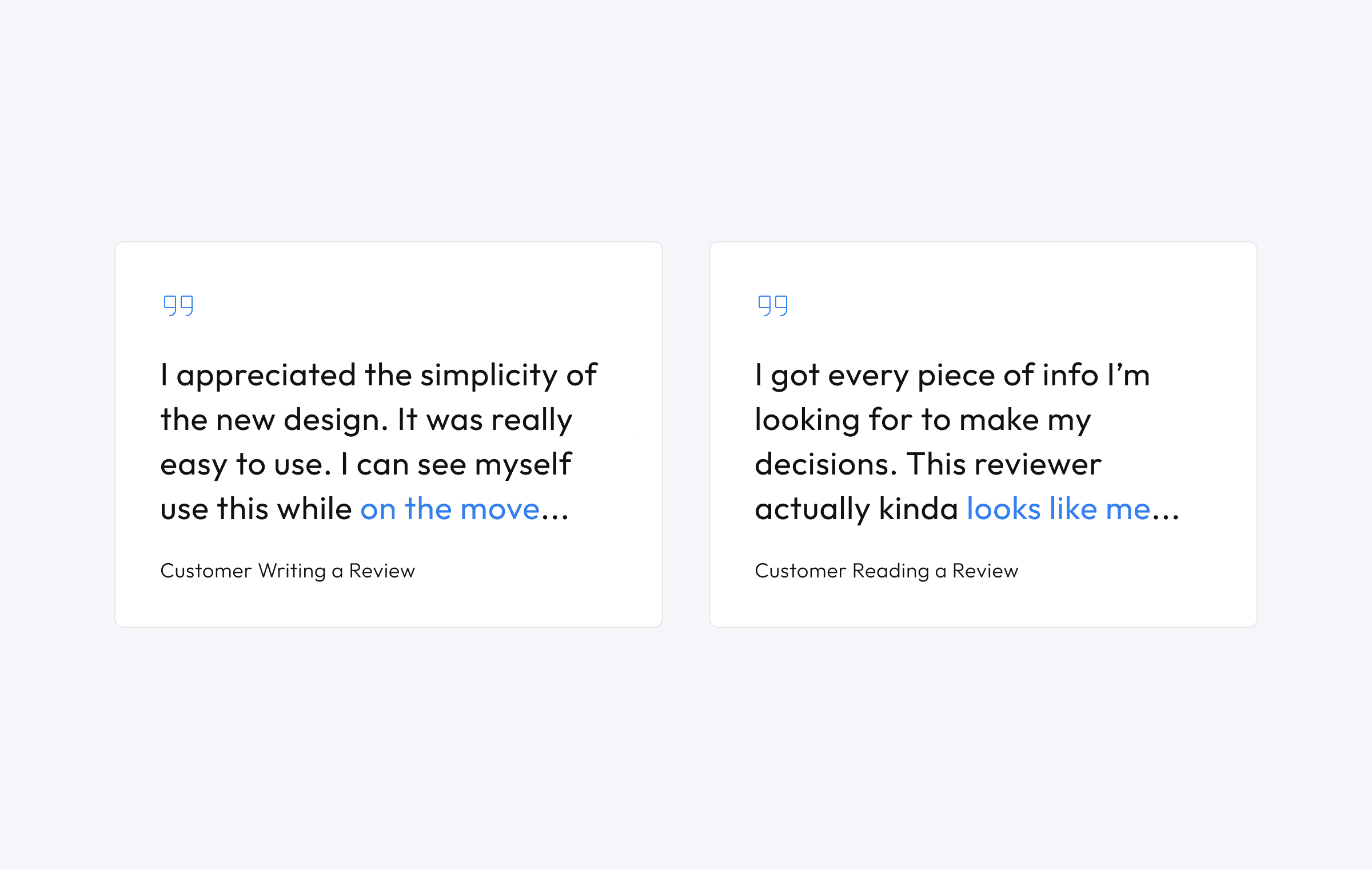
Customers told us that authentic product reviews from peers was the best way to gain deeper information about a product. They also told us that the standard information you see in reviews is important but often not enough to make a confident purchase:
I want relevant (to me) sizing & fit information
I want information quickly from relevant sources
I want information from authentic sources

Story Tangent
Early missteps lead to a better approach
Our initial conservative approach incorporating legacy elements performed poorly:
Below-industry average on multiple attributes, especially aesthetics
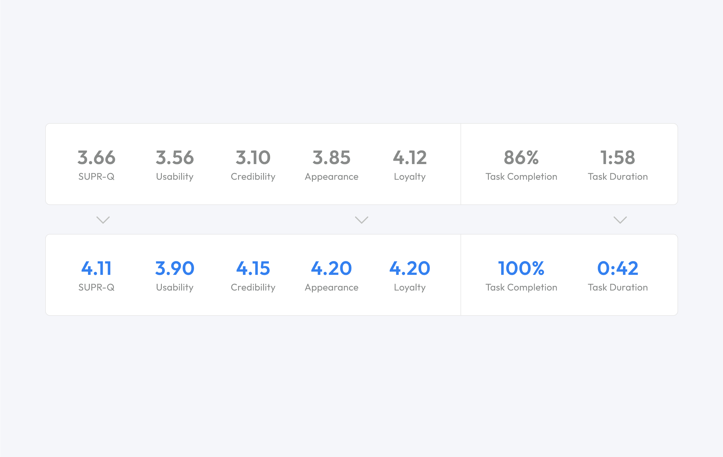
86% completion rate but task duration of 118 seconds—too long for mobile
Users questioned review legitimacy
Lacked harmony with the broader app experience
After making the case that aesthetic harmony directly impacts brand trust, we secured engineering support for a pseudo-headless implementation giving us deeper customization control.

Design Element 3
Mechanism of interaction
Swipe to browse - fast way to browse from one to the next and to get through large volumes of reviews, but not great for deeper research.
Accordion - users are able to see details without having leave the page, yet opening/closing large accordions create scrolling complications.
Visualization of metrics - explored ways to show large amounts of information that was digestible. The grid proved be unscalable.

Design Element 1
Building trust with design elements
We discovered that establishing trust quickly was crucial for engagement. Our research showed that displaying negative reviews actually built trust rapidly, though we needed to limit them to three initially to avoid adverse effects. We enhanced trust through:
Negative Reviews = Good: Displaying negative reviews to build immediate trust
Fancy Badges: Implementing verified purchase badges with subtle animations
Highlight Reviewer: Adding reviewer profile information and community recognition

Design Element 2
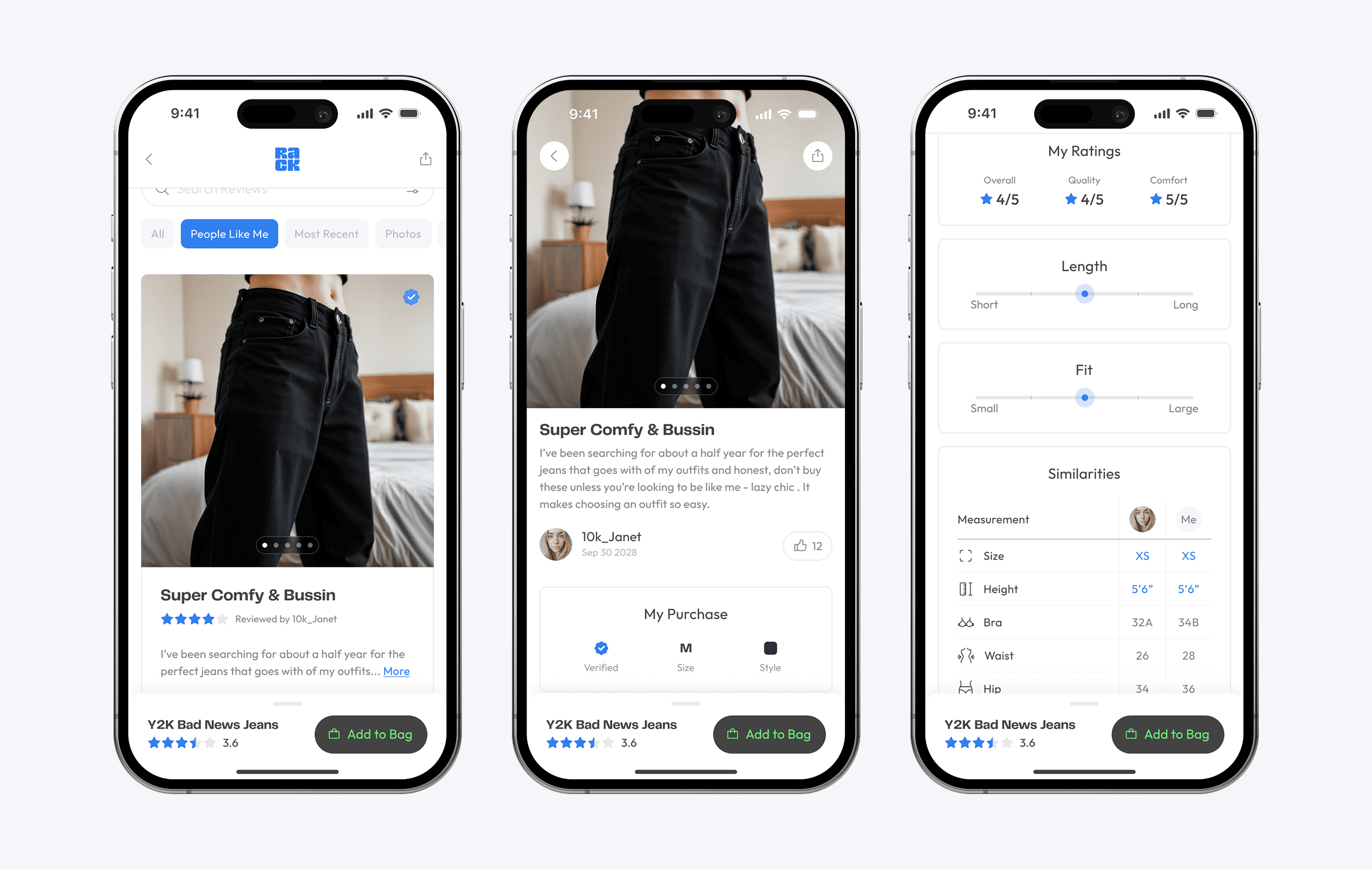
Show people like me
To reduce task duration, we focused on surfacing the most relevant reviews first. Given that sizing, fit, and styling were top priorities, we prioritized reviews from users with similar characteristics. We prominently displayed body metrics that matched with the user, making it easy to identify relevant experiences quickly.
Prioritizing reviews from users with similar body metrics
Creating scannable content with strategic icons and logical grouping
Maintaining conversion focus with sticky product name and 'Add to Bag' button

Final Designs
Relevant, simple, trustworthy
Our final iteration focused on content design principles:
Enhanced scannability through strategic use of icons and logical grouping
Implemented sticky footer with product name and 'Add to Bag' button
Maintained conversion focus while delivering comprehensive information
Created clear visual hierarchy for quick information processing


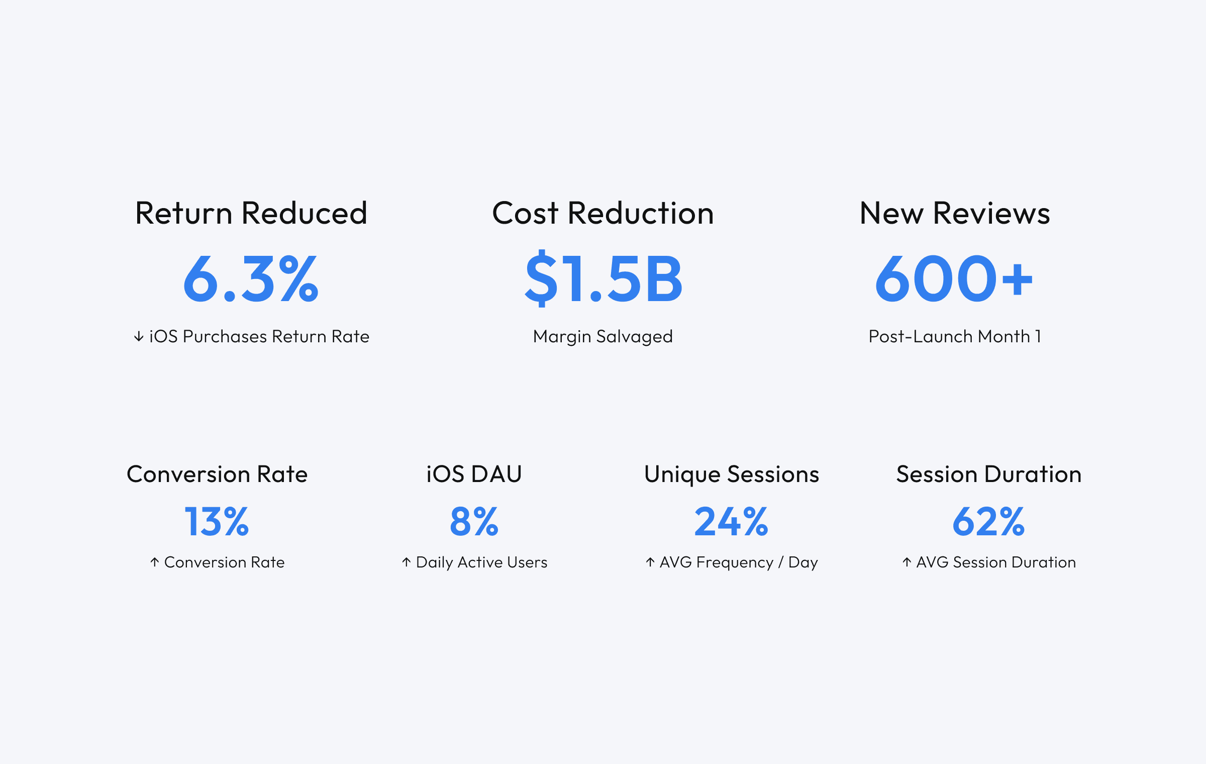
Impact
Quelling customer doubts
After implementing our design changes, we conducted a follow-up study that revealed significant improvements across all key metrics.
These improvements validated our approach to balancing speed with comprehensive information, and confirmed that our focus on trust-building and content design resonated with users. The dramatic reduction in task duration, combined with increased completion rates, suggested we had successfully streamlined the review discovery process without sacrificing quality of information.
The larger returns initiative (all returns projects combined) helped reduce overall returns from 58% to approximately 40% – translating to an estimated $1.53B in savings. But perhaps more valuable was the transformation in how we approach product development.
One of our most controversial decisions was displaying negative reviews prominently. The data proved our hypothesis - that showing the negative reviews with the positive reviews was integral to our customer experience:
Legacy
Growth in business and team dynamics
The project catalyzed the development of Nordstrom Rack's first WCAG AA-compliant design system and established a new model for cross-functional collaboration. One team member reflected, "We didn't just build a better review system—we discovered a better way of working together."
The controversial decision to display negative reviews prominently proved essential to building customer confidence, ultimately demonstrating that transparency builds trust in ways that directly impact the bottom line.
Nordstrom Rack would, in 2 more years to be regarded the fastest growing business within Nordstrom, capping at $2.4B in annual net revenue.


